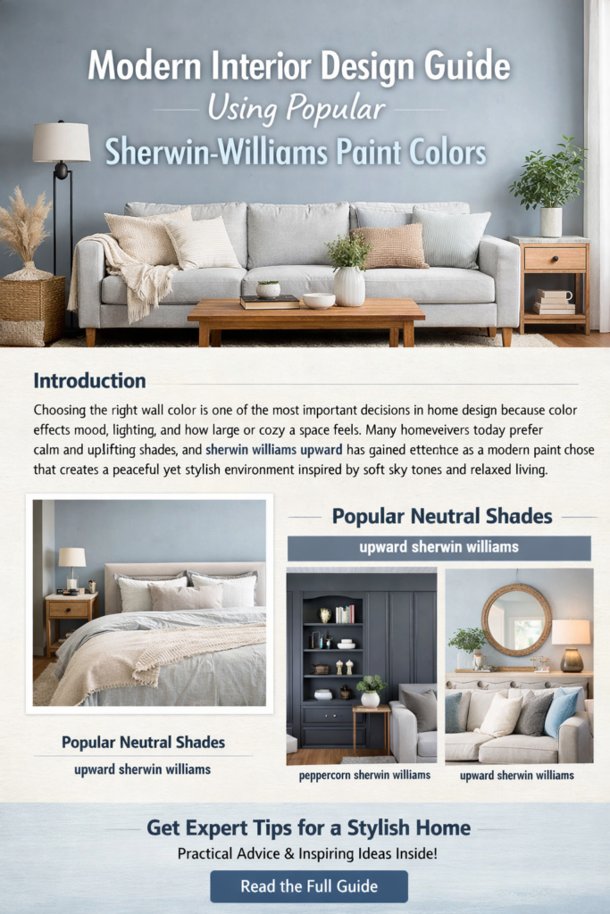
Introduction
Choosing the right wall color is one of the most important decisions in home design because color affects mood, lighting, and how large or cozy a space feels. Many homeowners today prefer calm and uplifting shades that work across different décor styles, and sherwin williams upward has gained attention as a modern paint choice that creates a peaceful yet stylish environment inspired by soft sky tones and relaxed living.
What Makes This Color Trend Popular
Interior designers increasingly recommend colors that feel natural and adaptable instead of bold shades that quickly go out of style. The soft blue-gray appearance of upward sherwin williams reflects modern design preferences focused on wellness and comfort, aligning with the trend toward calm interiors that promote relaxation and creativity. Experts describe the shade as a breezy blue that encourages a clear and peaceful atmosphere in living spaces.
Visual Inspiration for Soft Blue Interiors

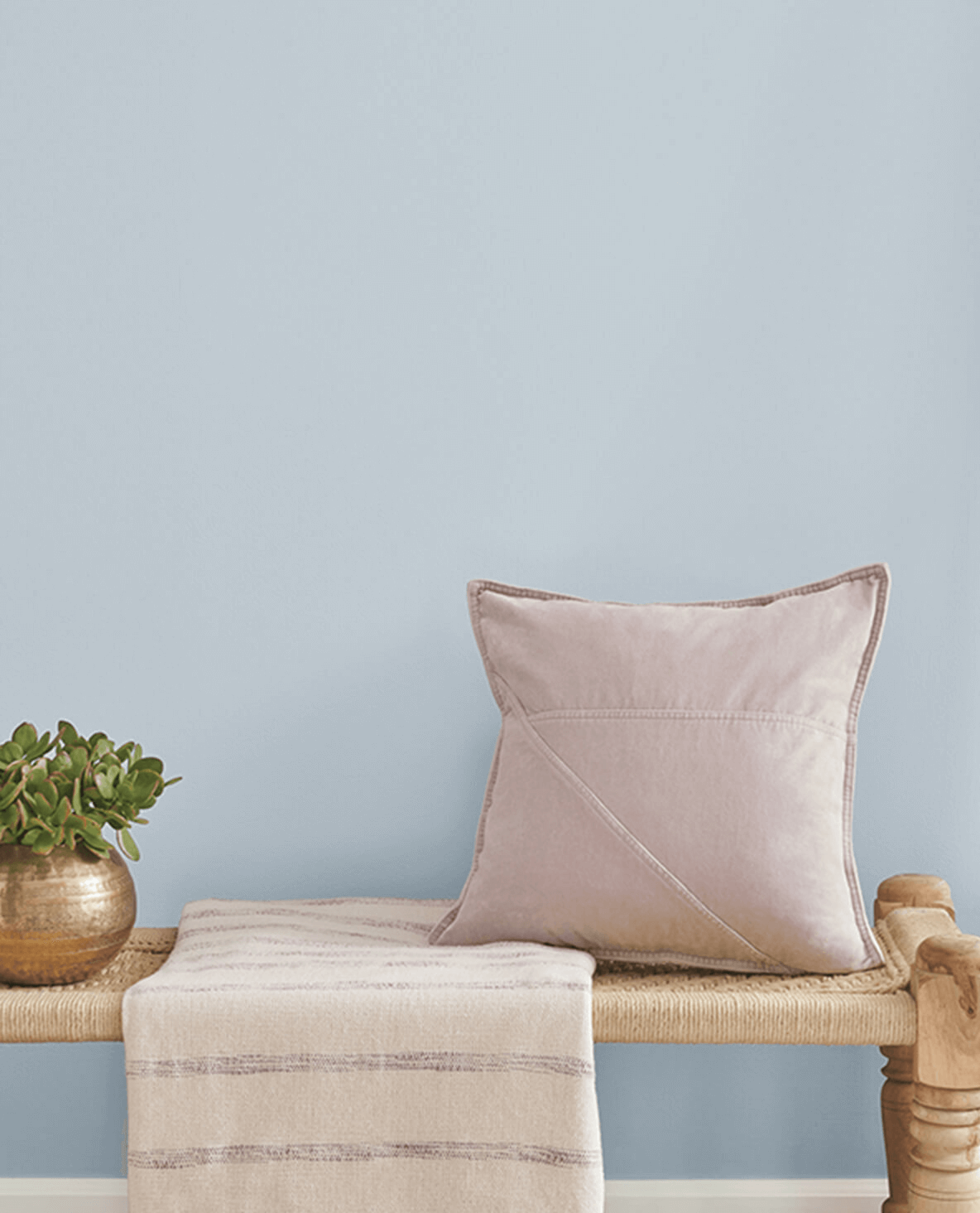
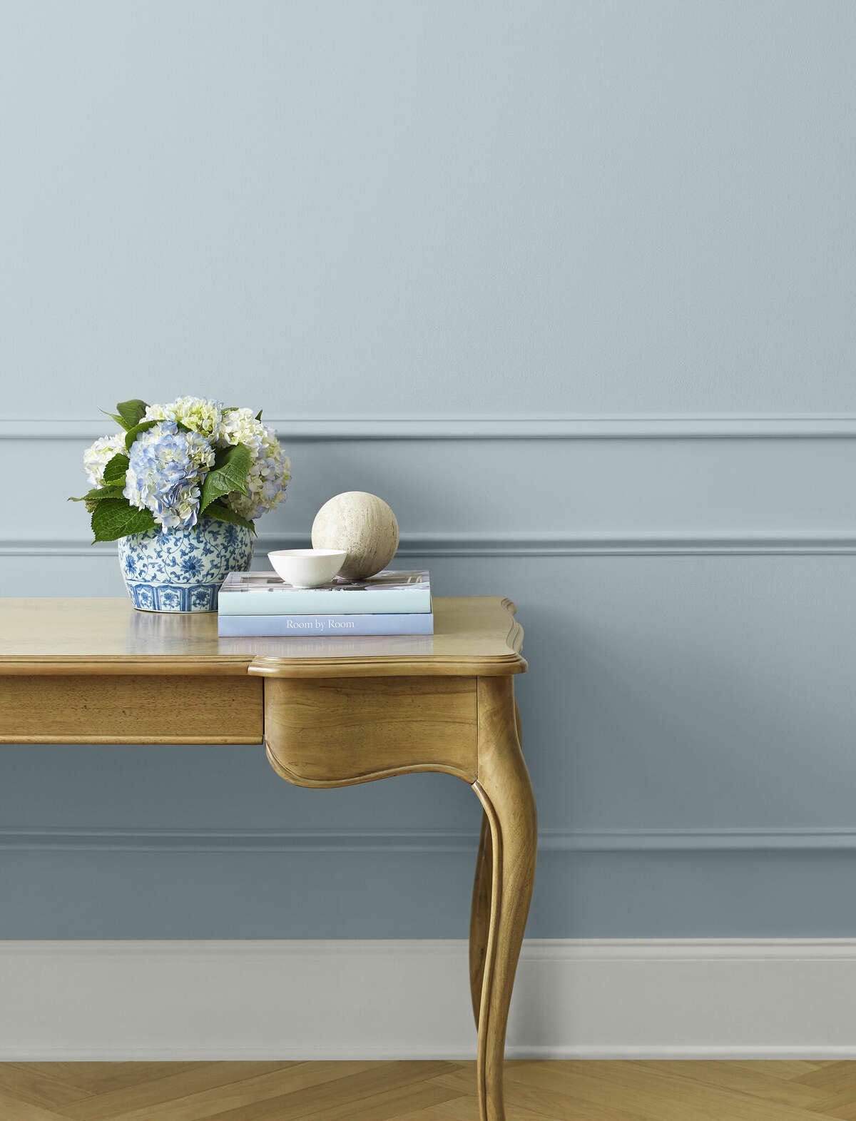
Modern interiors often combine light wall colors with natural textures such as wood, linen, and neutral furniture. Designers appreciate how sherwin williams upward reflects light gently, helping rooms feel open without becoming overly bright or sterile. This balance allows homeowners to create welcoming environments suitable for both relaxing and entertaining.
Why Neutral Shades Still Matter
While light colors create openness, deeper tones are essential for contrast and visual structure. Many designers pair soft blues with darker neutrals to avoid flat-looking spaces. A shade like peppercorn sherwin williams works effectively as an accent wall or cabinetry color, adding depth while maintaining a sophisticated and balanced appearance throughout the home.
Ideal Rooms for Calm Paint Colors
Bedrooms, offices, and reading spaces benefit from shades that reduce visual stress. Because upward sherwin williams contains subtle gray undertones, it feels calm rather than overly cool, making it suitable for areas meant for rest and focus. Designers often use similar tones to create spa-like environments that support relaxation after busy days.
How Lighting Changes Paint Appearance
Lighting dramatically influences how paint colors look throughout the day. Natural sunlight highlights undertones, while evening lighting can deepen or soften hues. Homeowners frequently choose sherwin williams upward because it maintains a consistent appearance under different lighting conditions, helping rooms look harmonious from morning through nighttime.
Creating Balance with Accent Colors
A well-designed space combines light and dark elements for visual interest. Accent furniture, trim, or feature walls painted in peppercorn sherwin williams introduce contrast that frames lighter walls beautifully. This technique helps highlight architectural features and gives interiors a designer-inspired finish without overwhelming the overall aesthetic.
Matching Furniture and Decor
Successful interior styling depends on coordination between wall color and décor choices. Neutral fabrics, warm woods, and metallic accents pair naturally with upward sherwin williams, allowing homeowners to update decorations seasonally without repainting. This flexibility makes the color especially attractive for long-term design planning.
Why Designers Recommend Soft Blue Tones
Soft blue shades have become popular because they combine emotional comfort with timeless appeal. Industry experts describe sherwin williams upward as a calming blue-gray tone that supports wellness-focused interiors and reflects a broader movement toward peaceful home environments.
Practical Painting Tips Before You Start
Before committing to a full repaint, professionals recommend testing samples on multiple walls. Observing upward sherwin williams during different times of day helps reveal how shadows and lighting interact with the color. Sampling prevents surprises and ensures the final result matches expectations.
Conclusion
Modern home design focuses on comfort, simplicity, and timeless style rather than short-lived trends. Choosing adaptable shades allows homeowners to refresh décor without constant repainting. By selecting calming tones like upward sherwin williams, it becomes easier to create interiors that feel welcoming, elegant, and perfectly suited to everyday living.
FAQs
Is this paint color good for small rooms?
Yes, many designers recommend sherwin williams upward because its light-reflective quality helps smaller spaces appear larger and brighter.
Can dark colors work with soft blue walls?
Absolutely. Using peppercorn sherwin williams as an accent adds contrast and prevents rooms from looking flat.
Does this color suit modern homes only?
No, upward sherwin williams works well in traditional, transitional, and contemporary interiors due to its neutral undertones.
Should I test paint before painting the whole room?
Yes, applying a sample of sherwin williams upward allows you to evaluate lighting and ensure the color matches your design goals.

